The complete solution for enterprise comunication
A B2B all-in-one platform for messaging across multiple channels, managing contacts, and automating workflows effortlessly.
The Culture Shift
As lead designer, I drove a data-driven approach to the design process, integrating tools like FullStory for user behavior analysis and Maze for user testing. Through workshops, I equipped designers with these tools to amplify their influence and enrich our product development process.
The Product Change
Aside from managing the design team, I was responsible for numerous evolutions in the platform, including:
Let's focus on this delivery
This case is light in terms of business context and illustrates a good portion of my design process.
THE PROBLEM
Pageviews to First-Value
Initially, it seemed that a new user only required 4 page views to reach the first product feature — sending a message. However, I delved into the Fullstory log using Python, and I found a contrasting reality: on average, users needed 16.8 pageviews to access this essential feature.
This discrepancy highlighted a critical challenge: user activation. In any subscription-based model, inactive users are at risk of churn, underscoring the need to simplify the user flow.
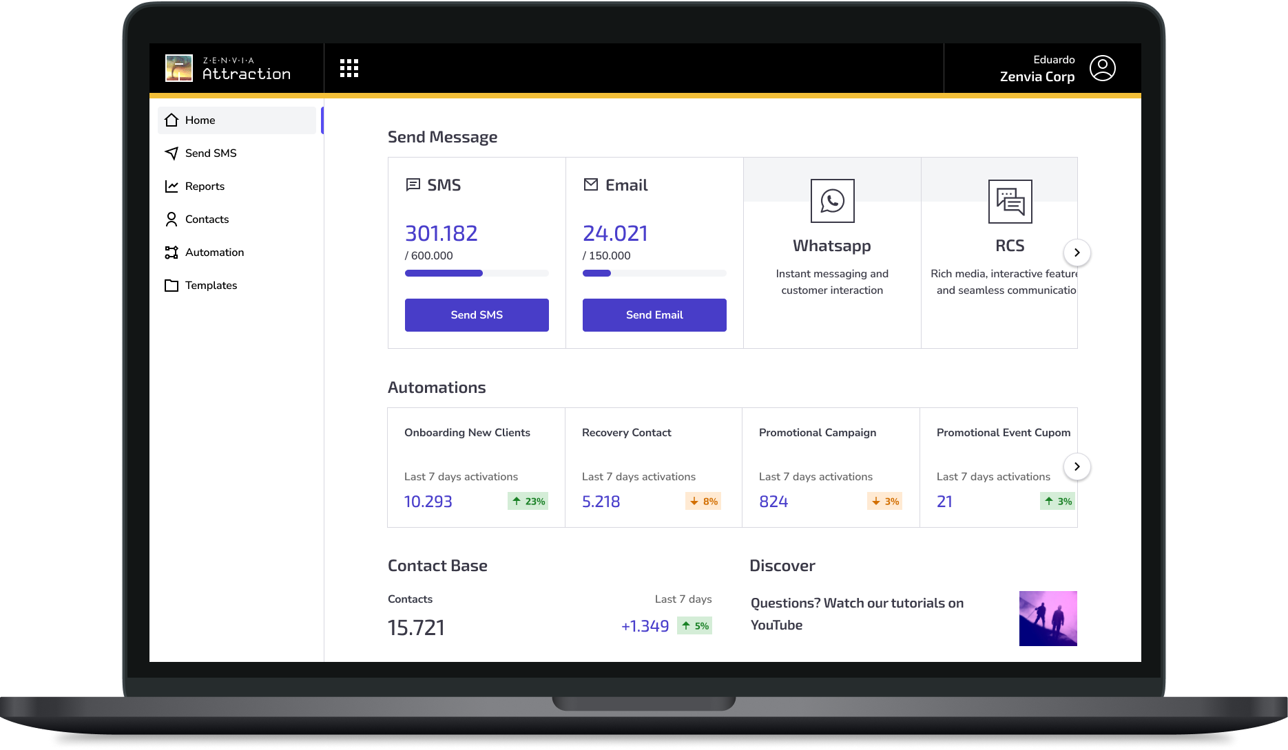
With these insights, I evaluated a series of initiatives to enhance user activation. This included a redesign of the Zenvia Attraction Homescreen, which we will explore further below, aimed at minimizing friction and optimizing product activation.
IDEAL FLOW
4
Pageviews to Send Message
ACTUAL FLOW
16.6
Pageviews to Send Message (AVG)
OLD HOMESCREEN
Main Oportunities
Activation
Lack of hierarchy fails to emphasize the next action
Onboarding
Unused features are represented by '0' instead of explaining their value
Navegation
The cluttered sidebar further complicates product comprehension
REDESIGNED
New Attraction
Homescreen
ACTIVATION
Highlighting the Main Action
By spotlighting its core features, users can now immediately recognize the next course of action. Additionally, I enhanced the visual representation of non-subscribed channels, emphasizing their unique benefits to inspire exploration and engagement.
Hover it!
ONBOARDING
Communicating value upfront
As a refinement of the onboarding experience, I've introduced informative explanations for previously underutilized features. This enhancement ensures users gain a clear understanding of all available functionalities, maximizing their adoption.
NAVEGATION
Simplifying product understanding
from 14 itens

to 6 itens
I streamlined the sidebar from 14 items and 4 divisions to just 6 key items, reducing the paradox of choice and simplifying understanding of the product capabilities. Also, I unified the experience across all Zenvia solutions, ensuring consistency and ease of navigation for users across platforms:

Results
Pageviews
for Send Message (AVG)
Activation
for Contacts and Automation
Error Clicks
Clicks on non-clickable element